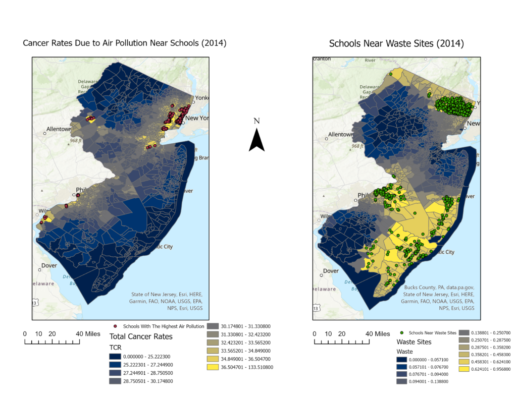
This is a comparison between two NJ maps developed using the same data set. I wanted to see how many NJ schools are in the top percentile for cancer risk, and how many schools are located near waste sites. While creating these maps, I discovered that 23 of these schools are in both categories, meaning the children that attend these schools are at a very high risk of developing cancer.